There's a joy in seeing this project come together so well. This project: my roll-your-own CSS Framework. Before I start in on this article, know that all the screen shots on this page are thumbnails ... if you click on them, you will get the larger view, an actual screen shot of my desktop.
My CSS Framework nears completion. All of the functional parts are complete: buttons, forms, colors, boxes, sections, all typography. To help fine tune it, I have been working on key layout components. And they are necessary too.
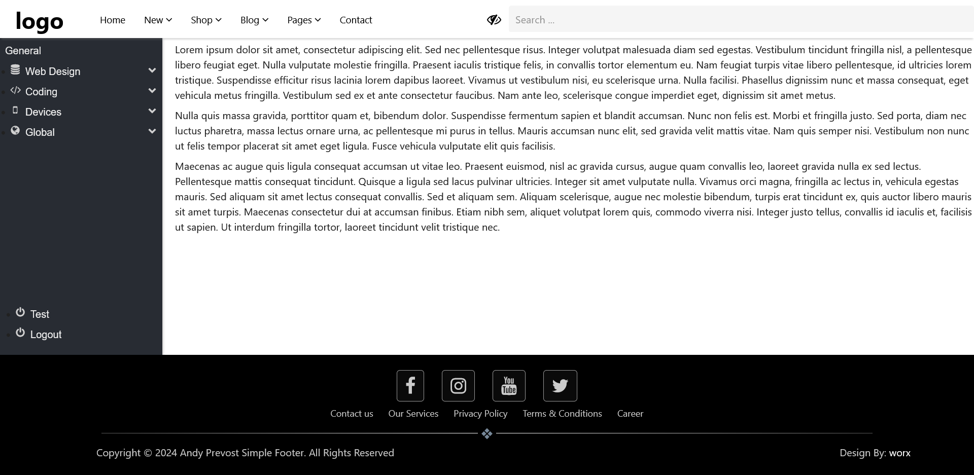
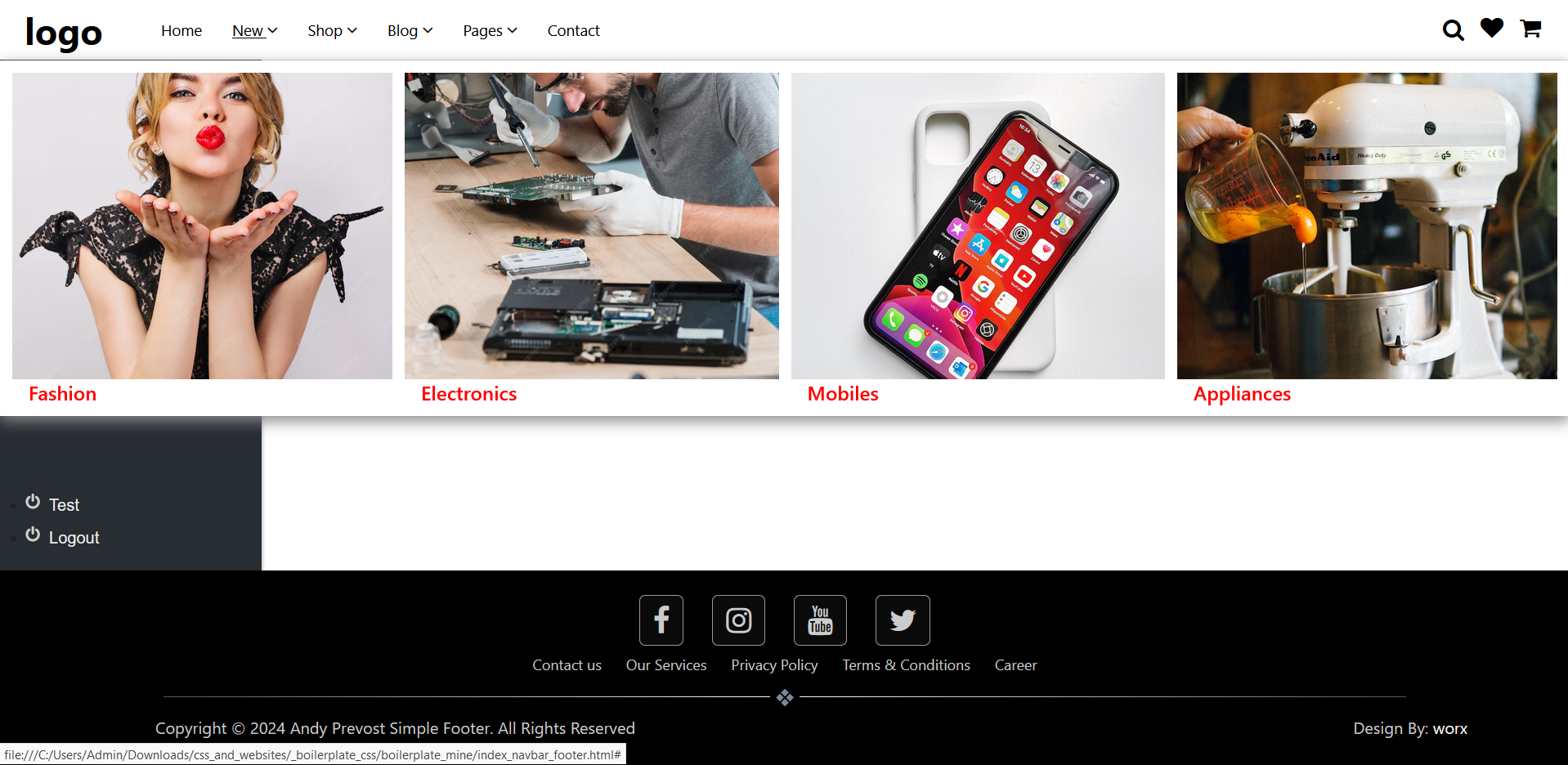
Three major components, all shown in the top right picture:
- Horizontal Navigation Bar. This is one of the page designs that I use the most. I wanted it flexible enough to handle just about every possible design requirement. The features of this:
- Sticky (displays even when scrolling)
- Full with with three major "sections" ... brand at the left, main menu in center, info menu at right
- Info menu includes optional search function and social media icons (in any order: search bar can be far right)
- Drop down functionality supporting a regular single level submenu or a multi-column mega menu
- Footer. Again one of the page designs that I always use. Features:
- Sticky (displays even when scrolling)
- Full width with with three major "sections" ... social media links at the top, followed by info (legals) menu, and copyright bar at the bottom.
- Horizontal line with second end marker separates top from bottom footer and bottom line is copyright message (left) and site designer link (right).
- Sidebar menu. This one was a major challenge. I designed this sidebar menu to use as a full height container separate from the main contents flow. I wanted to use it with my new CSS Framework, but this time flexible enough to include in the main contents flow and support full height of the main contents area ... with the top of the sidebar reaching the bottom of the top horizontal menu and stretching all the way to the top of the footer. Plus, I wanted the sidebar divided into two sections. The upper section for menu items, the lower section (near the footer) for "utility" links (like a logout button). The biggest challenge was not to the sidebar menu itself, it was the underlying contents container. Any regular height instruction was ignored ... after hours of coding and testing, I finally found the solution: a simple one liner addon to flex (height within flex). Features:
- Fixed to left side (can be switched to right side, it's all in the HTML for positioning)
- Divided into two sections: top for regular menu items, bottom (pushed down to be near footer) for utilities (ie, logout)
- Full support for drop down items (on the top portion)
- clicking displays submenu
- click on another dropdown will automatically close all open submenus
What's next? A new "hero" section. This will be multi-use, so I suspect it will include a basic image carousel. Hero section will have ability to display text on static portions, and different text on image (in carousel) portions. After that? A "price/product" section to display a number of "card" style elements with one as the default slightly larger than the others (as the recommended price or product).
Below are two more screen shots. One shows the search box after clicking on the magnifying glass icon (the icon to the left is to close the search box) and the second shows one of the mega menu links after hover. The mega meu fills the width of the screen, to a maximum height of approximately 300pixels plus 2 rem.